Designing Tri for Les: Lavaman

Triathlons and fundraising have taken up the large majority of my time over the past year and I wanted to take a moment to show how I incorporated and sharpened my design skills on the road leading to my recent Tri for Les Lavaman race.

I designed the images below in Photoshop with a few key elements in mind:

  • Purple drops – to represent Team in Training and LLS
  • “Live every day” – a quote from my aunt Leslie, to whom Tri for Les is dedicated
  • Triathlon – swim, bike, run

Emblem logo. Designed with guidance from this this excellent tutorial.
Tri for Les Emblem Logo


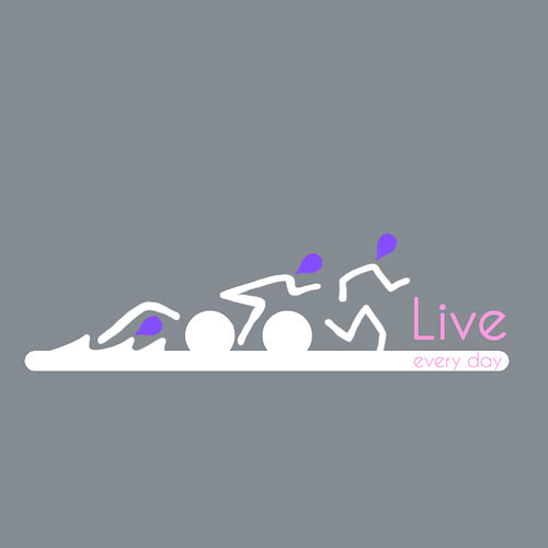
Stick figure 3.0 (Click here to see version 2.0)
Tri for Les Stick Figure Logo White


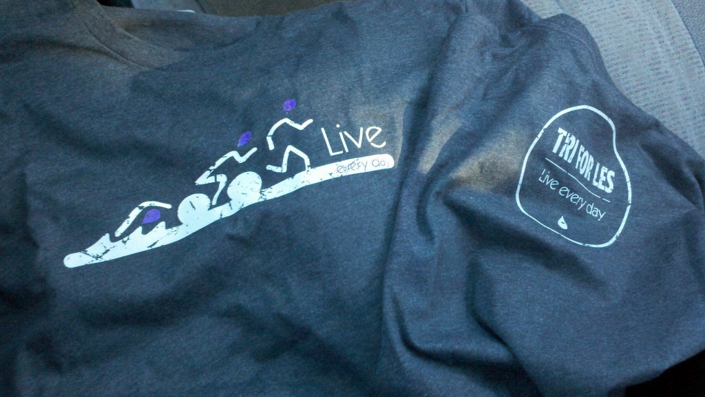
T-shirts with emblem on back, stick figure logo on front and cool filter applied. The shirts were a soft blend from Next Level and we used a single-pass printing technique to give the shirts a vintage feel to go along with the vintage look. Thanks to Brand-X t-shirts for the excellent printing and support.


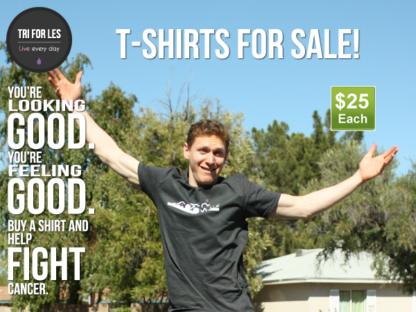
Web promo image to help sell the t-shirts. Note: goofy airborne face effect achieved without Photoshop.


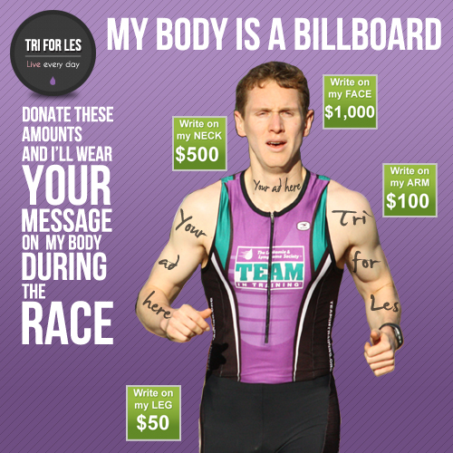
Web promo image to help sell my body ads


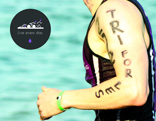
Thank you card I sent to my supporters after the race.
Thank you card: Tri for Les Lavaman


Designing TriforLes.com was another big job in itself and allowed me to tell the story and keep my supporters engaged in fun and unique ways. It’s a pretty basic layout, but it looks sharp (in my opinion) and was well worth all the extra time and energy.